Common features
This topic lists the common features available in Service. For features specific to Classic session functions, refer to the Common features in classic screens topic.
Standard buttons and icons
| Button/Icon | Action |
|---|---|
|
Add a new record. |
|
|
Black X—Close a session or tab. White X (red button)—Close the application or a window. |
|
Delete a record. |
|
Edit a record. |
|
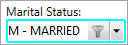
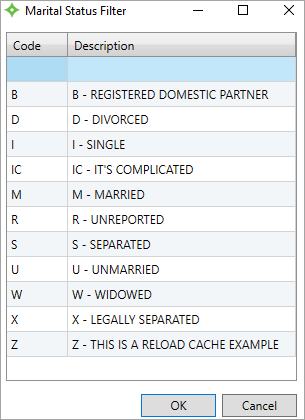
Filter Search— Some lists allow you to filter the list contents so you can quickly find the item you need.
|
|
Clear the table filter. |
|
This icon displays on summary panel tool bars and when clicked, opens a tab with more information. |
|
Re-size a summary panel—The panel will expand on the left side of the Summary tab while the other three panels adjust to fit on the right. |
|
Print the active screen—When you click the icon, the Print window opens. Select your printer and print options, and then click Print. |
|
Click to open the online help or point to display help text. |
|
Display the Invalid Data table to see details about invalid data on the screen. See Invalid data. Note: Contact your system administrator for assistance in correcting data that isn't accessible via a Service screen. |
|
Refresh the data on the tab or in a table. |
|
Undo all changes made. The information on the screen will return to the most recently saved values. |
|
Save data. |
Standard notifications
| Notification | Description |
|---|---|
|
Indicates there is an image (scanned document) linked to the record. Click to view the image. |
|
You can also view alerts in the Alerts tab at the bottom of a session.
|
|
Invalid data warning—Indicates the field contains invalid data, but you can still save. See Invalid data for more information. |
|
Open Correspondence Item |
|
Show More—Indicates there is more information than is showing on the data tile |
|
|
Favorite or preferred—For example, this icon next to a data tile phone number indicates that it's the preferred contact method. |
|
* |
Required—You must type data in the required fields to save the record. |
|
|
Stop—Indicates the field contains invalid data that can't be saved. Update the value to save the record. See Invalid data for more information. |
|
Red outline |
A required value or information is missing or there's invalid data. See Invalid data for more information. |
|
Masked data—Data might be masked if its sensitive data and you don't have permission to view it. Contact your administrator regarding your security settings. Note: Masked data is read only. You can't edit it, even if you have permission to add, update, or delete data in a function. |
 Alert
Alert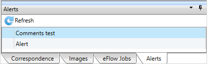
Standard messages
| Message | Description |
|---|---|
|
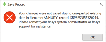
Save Record "Your changes were not saved due to unexpected data in filename: XXXXX, record, XXXXX*XXXXXXXXX. Please contact your basys system administrator or basys support for assistance."
|
Displays when you haven't saved a file you're updating and changes are made to the file elsewhere that depend on previously existing data in the file. For example, if you update a member's Annuity with transactions and don't save them, and then create and transfer contributions for the member, you can't save contributions for a fund that the member hasn't been associated with yet. |
| "This record is locked by [operatorname] and cannot be saved." |
Another operator is currently making changes to the record. You can't update the screen until they are finished and save their changes. Click Best Practices: We recommend that you contact the operator about saving and leaving the record so you can update it.
|
| "Your changes were not saved because the record has been updated by another user. Do you want to reopen the record?" | Another operator had made changes and saved the record before you did. Click Refresh to reopen the record with their saved changes. Click Cancel to not open the record. You still won't be able to save your changes. |
Standard Shortcut Keys
| Keyboard Shortcut | Action |
|---|---|
| Alt + D | Display list items. |
| Ctrl + X | Cut a selected item. |
| Ctrl + C (or Ctrl + Insert) | Copy a selected item. |
| Ctrl + V (or Shift + Insert) | Paste a selected item. |
| Ctrl + S | Save any modifications. |
| Ctrl + Shift + Tab | Toggle through session tabs. |
| Up or Down arrow | Scroll through list items. |
| Ctrl + P | Print the current screen. |
| Ctrl + Esc | Close an active window or dialog. |
| Ctrl + F5 | Refresh the active window. |
| Ctrl + F1 | Open the Help application. |
| Space bar | Add or clear a check mark. |
| Advanced Search Shortcuts - These options are available in the Advanced Search window. Access this window from the Search menu and select Advanced. | |
| Alt + S | Perform the search. |
| Alt + E | Clear any search fields. |
| Alt + N | Open the Add New dialog where you can add a new member, employer, etc. |
| Alt + O | Open the selected (active) search result. |
| Alt + C | Close the search window. |
Table features
This sections lists the general features found in most tables. Some tables are customizable (you can choose the columns that display, set the column order, and choose column headings). Refer to the Views for details on adding and updating table views.
| Function | Description |
|---|---|
| Filter |
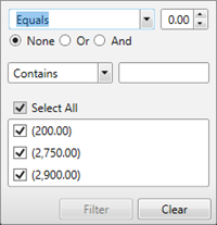
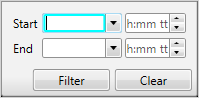
Some table columns have an option to filter the contents so you can quickly find the item you need.  How to use the filters How to use the filters
To remove the filter click When data is filtered out of the initial display, it's noted below the table. |
| Group |
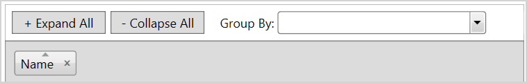
You can group data that displays in the table so its easier to read and more useful, by a date or amount for example. 
The data you want to group by must already show in the view. If it doesn't, refer to Views to add columns to the table. To add a grouping, click the column heading and drag it in the area above the table column headings or use the
Select
|
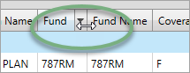
| Sort |
Click a column header to toggle between ascending and descending sort order. An arrow above the header name indicates the sort order. 
|
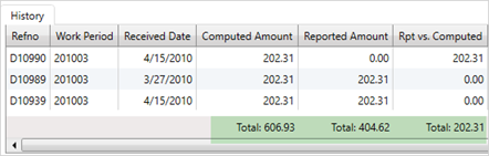
| Total |
Some tables have a summary row at the bottom that displays the totals for certain columns.
The total is the sum of the displayed column data. If the data is filtered, the total will be for the remaining table data. You can't manually add or remove totals. |
| Move columns | Drag the column header to a new location on the table heading row. |
| Re-size columns |
Point to the border between two columns to re-size. When the cursor becomes a You can also double-click anywhere in a column and that column will re-size to fit the column text. The settings will remain the next time you access the table. Note: The Correspondence table is the only table that will revert back to its default column sizes. |
| Expand and contract tables |
Click the table header bar to expand or contract a table.
|
| Table—options menu |
Some tables have an Not all options are available for all tables. Print from table
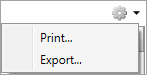 Export from table
|

 to expand or collapse the grouping. Click
 , drag the pointer to move the split line to the necessary size.
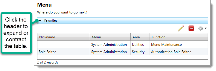
 in the right corner.